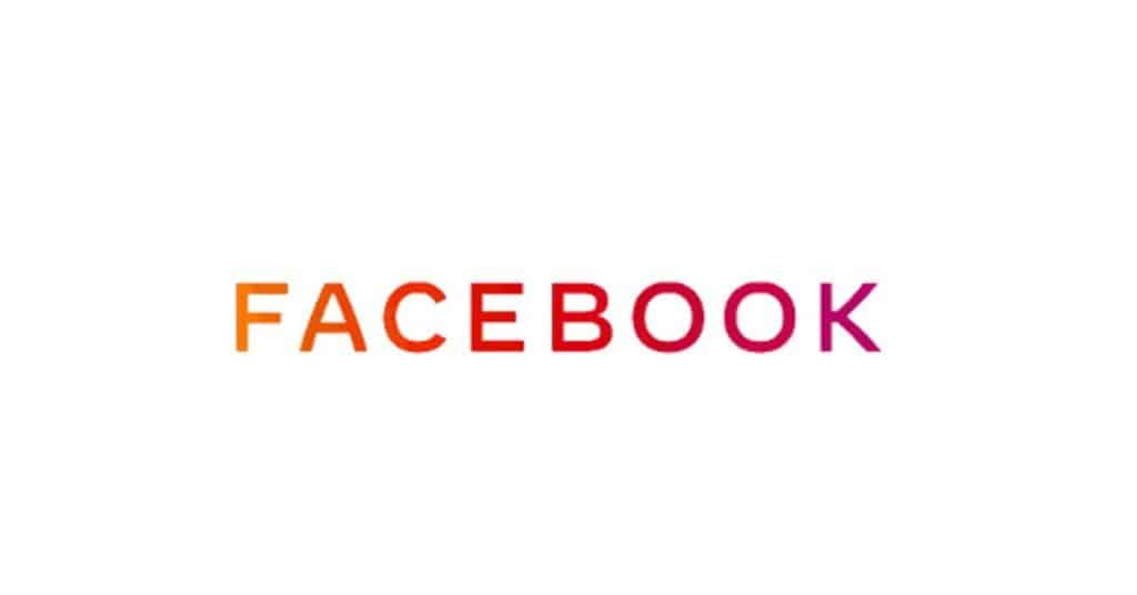
This week Facebook launched a new logo and explained that their selection of custom typography is “designed for clarity,” with the goal of creating a “visual distinction between the company and app.”
While clarity and even transparency are probably critically important for Facebook right now, I think their logo is a flop. Outside of agencies and design studies, I’m not sure that many folks would recognize this as “custom typography” and instead interpret that somebody took a quick and dirty shortcut to an updated design.
And therein lies the problem with logo design and type treatments. Development of logos, icons and type treatments to truly connote the emotion and value behind any brand is hard. It’s hardest for new companies, with few accomplishments to stand on, yet it is new businesses that are always in need of cutting-edge fresh design. And without clear definition around things like mission, vision and purpose, it can be super hard to capture “the vision” of a business and its ownership in a 1-inch stylized piece of art.
Why Pricing Logo Design is Hard
Logo design takes time and talent to develop, sometimes much more time and talent than startups can afford or are willing to invest. When designers do manage to capture that perfect emotion, approval by consensus from interested parties representing different functional areas and with varied perspectives from across the organization can be tough to obtain. So back to the drawing board they are often sent. And round and round it goes with each “small change” ringing up “not so little” change fees.
For bigger organizations, like Facebook, the hard costs of logo design are probably not a consideration or obstacle to new design but for most of our clients, they most certainly are an important consideration, and this is why we recommend a few things to keep the budget in check:
- Figure out whether you want a logo or just a type treatment. Facebook got a type treatment. Apple has a logo. Logos are more complicated to develop and have look original. Lots of people shortcut logo designs with clip art. You don’t want to find your logo being used later on by someone else as clip art. If you need to have your company name spelled out in your logo, a type treatment may be just the path to take. If you need an original design element to make you stand out, invest the time with an illustrator.
- Figure out what colors you like. Work in finance? Think blue for trustworthy. Work in construction? Think green for environmentally friendly. Work in Security? Avoid red because it is associated with danger.
- Figure out how you’re going to use the logo. Besides a website and possibly a business card, will your logo ever appear silk-screened on a t-shirt? Embroidered on a golf shirt? Embossed on a binder? Dye sublimated on a tablecloth? Off-set printed on linen? Foil-stamped on an envelope? Incorporated into every product you ship? It may sound petty, but each of these variations can limit your design options. Better to make these decisions now than later.
- Figure out what you like. Watch TV. Read the paper. Bring in the mail. Look at billboards. Go to the mall. Find at least five concepts you like and be ready to articulate the why behind them.
- Figure out what emotion you want your logo to communicate. This is probably the hardest part of logo design. What does the logo say about your and your business and the promise that you’re making to your customers?
This may seem like a lot of thinking and planning for a 1-inch design for the business cards or PPT deck you need to pitch for business next week but if you think about it as a logo that will follow your business everywhere for the next decade, I think you’ll agree that the investment is paltry compared to the reward.
This post courtesy of MMC Principal Jennifer Koon.


