In late December, Pantone, specifiers of design color palettes and printed ink colors worldwide, announced their 2020 color of the year Classic Blue to a great many yawns. You see, color announcements made by Pantone and their Pantone Color Institute in recent years have boasted a lot more personality as Pantone went to great efforts to be the pulse of at least some graphic design and home fashion for the upcoming months.
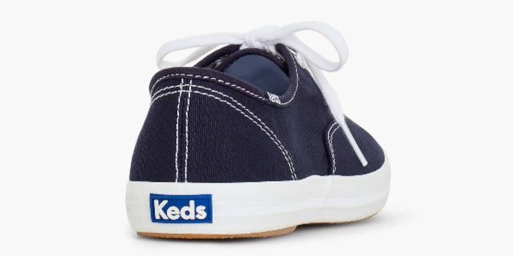
Regrettably, Classic Blue looks a lot like the rubber label on the back of a Keds sneaker (which intentionally or unintentionally is also known as classic) and for a great many outspoken media types that is just dull.
Regardless of how you feel about the color, you’re going to see a lot of it in 2020 because Pantone is busy rolling out color formula guides and tools to help designers who want to explore using the color for everything from graphics to fashion to home décor.
What I think it more important to understand is who is Pantone and why do they get to be in charge of color selection. Take note:
In 1963, Pantone revolutionized the printing industry with the colorful PANTONE MATCHING SYSTEM®, an innovative tool allowing for the faithful selection, articulation and reproduction of consistent, accurate color anywhere in the world. The tool organizes color standards through a proprietary numbering system and chip format, which have since become iconic to the Pantone brand.
Graphic designers, marketers and printers have subsequently locked step behind the PMS color system and use it religiously to communicate color selection from concept to execution. The standard ensures consistency regardless of designer or design platform and allows portability of work from one vendor to the next. With it, a customer can pretty much rest assured that Classic Blue 19-4052 (or whatever your firm’s preferred PMS colors are) will be the same whether you print it down the block or around the world, something that is important for companies with talent spread far and wide often relying on resources in their individual backyards to help maintain brand consistency.
Knowing your organization’s PMS colors and not just the RGB equivalent that a web designer chose to try and match your logo is imperative to successful brand management. Adopt them, share them, promote them and insist upon their use broadly to not only maintain your professional look but also to fend off imposters.
If you find yourself in 2020 evaluating colors for a new or refreshed brand or simply an updated color scheme for your collateral, insist the designer properly present options with the PMS color identified. Whether or not you choose to adopt Classic Blue as part of your 2020 color palette is up to you.
This post courtesy of MMC Principal Jennifer Koon.