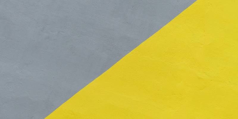
While most everyone can agree that 2020 is the year they are most happy to put behind them, it was of particular interest to me that when the Pantone Color Institute announced their 2021 Color of the Year on December 9, alongside Illuminating Yellow (PMS 13-0647) they selected Ultimate Gray (PMS 17-5104).
Gray? Really? Doesn’t Gray better summarize the emotion that we’re trying to get over as opposed to the year we’re looking forward to?
Pantone, the self-proclaimed provider of the “universal language of color” and the Pantone Matching System, is used by more than 10 million designers and producers around the world “to help define, communicate and control color from inspiration to realization.”
This year marks the twenty-second anniversary of their Color of the Year (COTY) program but the folks at our firm have been assigning and employing PMS colors to design files for decades. You see, as Pantone advocates, the assignment of a PMS color allows the designer to specify and control for color from design through execution. When a printed project goes on press, the pressman has the option to pour a can of PMS ink, for a perfect color match, or blend using a CMYK build – less accurate but often less expensive from a production standpoint for the client.
Interestingly the assignment of PMS colors for print purposes gained such traction in the interior design space over the years such that today I think that the selection of COTY has more impact on what you will see in stores, on furniture showroom floors and painted on home exteriors and doors than on what happens in printed marketing materials. For good measure, Adobe Stock build a library of creative assets employing the 2021 COTY which can be accessed here.
Which brings me full circle to my original point. After a year where the emotion most people felt was gray, I’m struggling with the design decision to include Ultimate Gray on the palette of COTY. Having recently redecorated a bathroom, I fully understand that Gray is the “it” color for interior design but that still seems too last year. I’d challenge that we should focus singularly on Illuminating Yellow as the brighter and cheerier inspiration that I hope both print and interior designers gravitate to in 2021.
This post is courtesy of MMC Principal Jennifer Koon