The Pantone Color Institute announced their color of the year this week. As a marketing professional who fields lots of questions about color combinations and scrutinizes print production quality as an occupation and a compulsion, this announcement always makes my radar and typically my personal blog calendar.
Why Pantone’s color trends can influence your brand
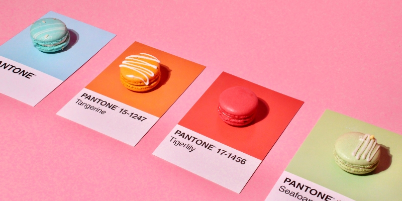
For the uninitiated, the Pantone Color Institute authors the Pantone Matching System (PMS) that printers and marketing pros for decades have referenced to select and assign so-called PMS color schemes to their work.
PMS colors are so precise that you can buy them in cans of ink, just like the paint you get at the home improvement store. This allows your printer to get a precise color every single time.
More often than not you’ll see your PMS color converted to a CMYK equivalent for the purposes of going on press. CMYK is Cyan, Magenta, Yellow and Black and represents not only the makeup but also the order of traditional offset print production equipment. When a precise PMS is required for consistent use, it typically is printed as the fifth or sixth ink on the offset equipment.
In today’s got-to-have-it-now consumer behavior and increasingly small print quantities, we find that more of more of your printed materials are run on a digital (think high-end color laser printer) as opposed to an offset press, where in most instances CMYK inks are used. As a result, it becomes increasingly difficult to get that perfect PMS match.
Today you may see color assignments on your digital assets represented with a HEX or RGB code but trust me that there is also a PMS equivalent. As a best practice in visual identity, you should establish and publish both your HEX or RGB standards as well as your PMS standards for your brand. Failure to do so will likely result in less than desirable outcomes on or offline.
What is the color of the year?
Which brings us neatly back to the discussion of the 2026 Pantone color of the year: Cloud Dancer 11-4201, what Architectural Digest calls a “balanced white that’s so versatile, the sky’s the limit.”
White, they picked white. I understand that white is a color (or absence of one), but I’m going to have a hard time getting excited about this color trend and advocating that clients choose white for their branded elements this year. I fully understand that Pantone needs to expand their relevancy beyond just printed ink on paper to colors chosen from fabrics and wall coverings, but this one feels like a miss to me. Is it too early to say, I’ll look forward to 2027?
This blog was contributed by Jennifer Koon, Principal of Michael Mackenzie Communications.